Calm over chaotic
Cross-app reasoning is distilled into a short chain and two plain sentences — never a data dump.
The AI co-founder for SaaS founders. A calm, warm surface — deep power underneath.
Founder2 touches high-stakes things — strategy, live revenue, customer email, production code. The interface has to feel calm, warm and precise: a quiet studio with a well-made document in the middle and a capable partner at your side. Every surface decision below follows from that.
Cross-app reasoning is distilled into a short chain and two plain sentences — never a data dump.
One terracotta accent against warm neutrals. Colour earns attention only when it means something.
Every claim shows whether it's verified or an assumption. Every button says exactly what will happen.
Sliders, chips and panels respond instantly and settle softly. Nothing spins, nothing flashes.
Calm surface,
deep power.
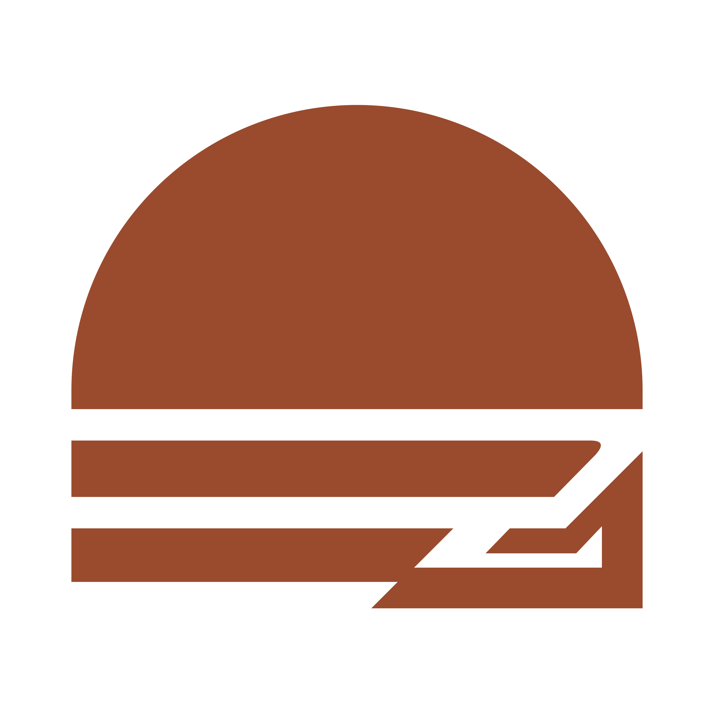
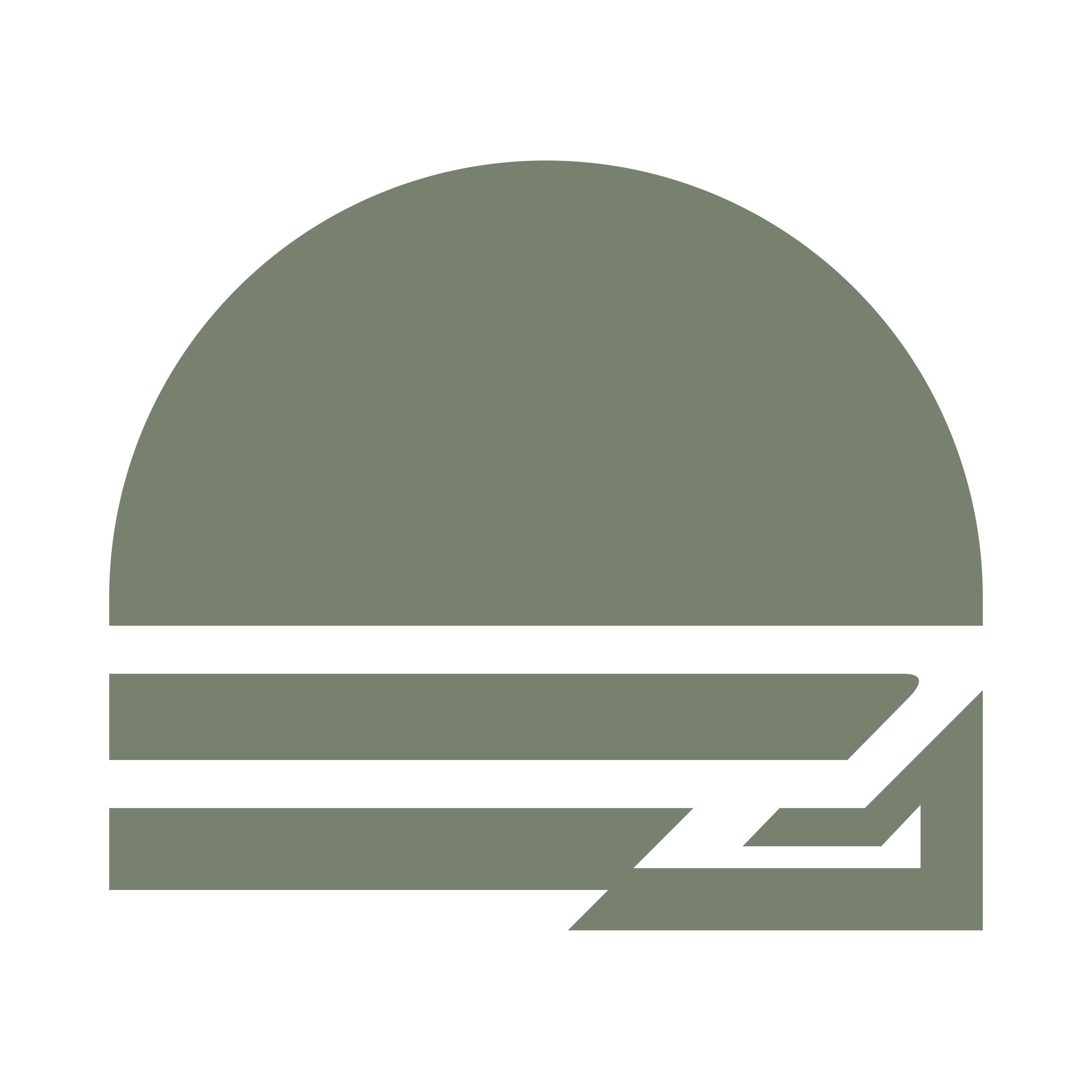
The Founder2 monogram folds a rising sun and the dune line into an F and a 2: a half-dome above, three stepped bars below, sharing strokes and one baseline. Terracotta is the primary; white is the cut for dark surfaces; the gradient leads where the brand fronts itself. Six colourways ship in the kit — recolouring by hand is never one of them.


Drawn on a 1000-unit grid. A single arc crowns the upper half — the sun line — and three stepped bars descend from it; the lowest shears into the diagonal foot of the 2. Everything sits on one baseline.

| /brand/0N_Symbol_*.{svg,png} | Symbol — six colourways · terracotta is primary, white for dark, the gradient for hero placements |
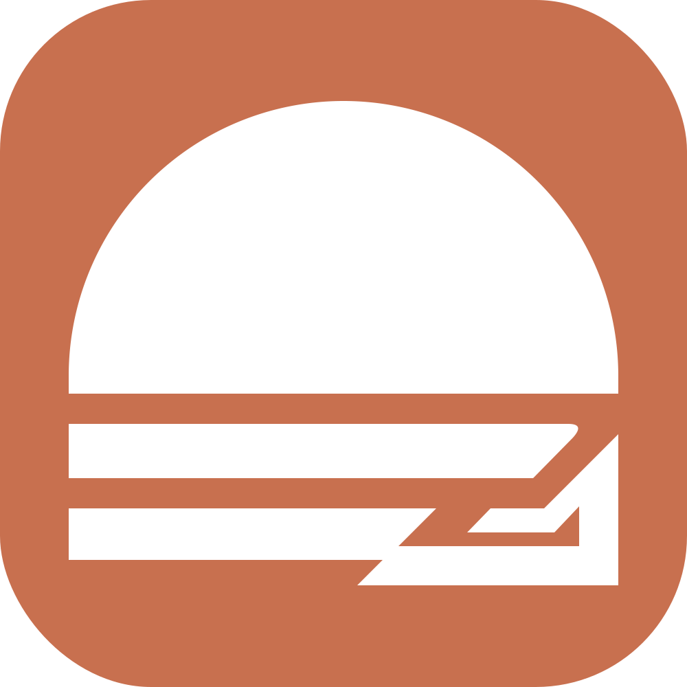
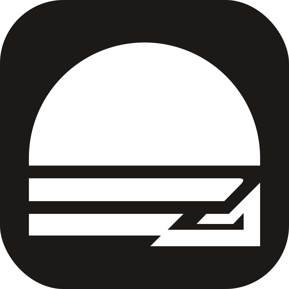
| /brand/0N_AppIcon_*.{svg,png} | App icons — rounded tiles in six finishes, mark reversed out |
| /brand/1N_Lockup_*.png | Lockups — six wordmark compositions, transparent and on-surface cuts |
| /favicon.svg | Favicon — the gradient mark, served at the site root |
~90% of any screen is warm neutral. Terracotta marks the primary action, active state and the logo — nothing else. Green, amber, red and lavender carry meaning, always paired with an icon or label so colour is never the only signal. Click any hex to copy.
Marketing speaks in Funnel; the product speaks in Geist. Both are provisional and open to revision — the pairing below is what ships today, not a final answer. Mono is reserved for code and data, never prose. Every number that can change uses tabular figures.
Headlines on site and deck. Slightly condensed, warm, a little editorial. 400–700, tight tracking.
Body and UI on the marketing surface. Pairs with Display at reading sizes.
Every product surface — documents, panels, buttons. Brand-guidelines doc also names Inter as an acceptable UI face; decide one.
Real code only: diffs, payloads, terminal, file paths — plus small mono labels on marketing. Never prose, KPIs or badges.
One 1px container per block; hairline dividers inside, shadows only on floating layers. Radii are small and concentric. The product's real UI, reduced to a specimen — this is the texture the identity must match.
Stripe shows cancellations up 24% in seven days. Support logs the same login-loop complaint across 42 threads; Sentry ties it to “invalid session” on the new auth release. The co-founder traced the chain and prepared a fix.
One terracotta action per area. Amber approvals name every effect; Red actions stay outlined and end in “…” — the accent never sits on a destructive action.
Outer radius = inner radius + padding. Depth comes from the 1px hairline, not shadows.
Diffs, payloads, terminal. Business prose always sets in the sans.
A co-founder speaks like a competent partner, not a pitch deck. Sentence case, verbs that name the effect, and every claim carrying its evidence state. If a sentence could run on any SaaS site, it doesn't run here.
“It found the churn spike, traced it to auth release 1.4.2, and wrote the fix. You approve before anything sends.”
“Supercharge your workflow with AI-powered synergies across your entire stack.”
“Approve: open PR + draft 4 replies”
“Submit” · “Continue” · “OK”
“Market size $4.2B — ⚠ untested assumption”
“Market size $4.2B”
The AI co-founder for SaaS founders.Primary — category + buyer
Calm surface, deep power.Brand idea — design line
You approve every write.Trust line — the promise
Motion confirms, it doesn't perform. One easing curve, three durations, no bounce. Live specimens below — they run on the product's own values and respect reduced-motion.
cubic-bezier(.2,.8,.2,1) — 140 / 240 / 420ms
Hovers, fades, chip toggles, reveals.
opacity .4 ↔ 1.0 · 2.2s
Working states pulse gently; a spinner only for actual steps.
stiffness 380 · damping 32 · mass .8
Panel modes and rail collapse. No visible bounce.
Everything on this page ships as files under /brand — six colourways of the symbol, six app-icon tiles, six lockups, in SVG and PNG. Press, partners and integration builders are welcome to them; the two lists below are the whole licence in plain words.
Six colourways, SVG and 3000px PNG on transparent ground — terracotta, black, white, rust, sage and the signature gradient.
Six rounded tiles for dock, home screen and avatar use — terracotta, black, ivory, rust, sage and gradient.
Six wordmark compositions — orange with black or white type, all-black, all-white, and cuts baked onto ivory and black.
The gradient mark serves at /favicon.svg; PWA icons render under /icons/; every file here is reachable under /brand.
Founder2 is a workspace where founders research markets, plan ventures and run a live SaaS business with an AI co-founder in a dedicated agent VM. It reads Stripe, GitHub, Sentry, PostHog and Slack; it edits the plan, runs the board, and asks before anything leaves the app. For press, partnership, or formats the kit doesn't cover — support@founderos.app.